
Images and media in Hatch
How Hatch Connect serves WordPress images on your Astro frontend: clean media URLs, image optimisation, lightbox, lazy loading, hover zoom and fallbacks.
Last updated October 30, 2026
By the end of this guide you will know how your WordPress images reach the Hatch frontend, how to turn on clean image addresses and optimisation, and which image display options you can set.
Where images live
Your images stay in the WordPress media library. You upload and insert them in the block editor as usual, with the Image, Gallery, Cover and Post Featured Image blocks, which Hatch styles in every design.
Clean media addresses
When image optimisation is on, Hatch rewrites every WordPress media address (/wp-content/uploads/...) into a path on your frontend (/hatch-media/...). The frontend has a matching route that fetches the file from WordPress and streams it to the visitor. This means:
- Visitors do not see
wp-contentin your HTML. - Images come from the same address as your pages, so there is no cross-origin request.
- The frontend can convert images, for example to WebP or AVIF with Sharp, before serving them.
Hatch also rewrites the responsive image sizes (srcset) and image addresses in its REST responses. It does not rewrite addresses in requests from the block editor, so the frontend address is never saved into your posts and nothing breaks if the frontend moves.
Turn on image optimisation
- In wp-admin, open Hatch and go to the Performance tab.
- Switch on Image optimisation. It is off by default.
- Save, then open a post on your frontend and check that image addresses start with
/hatch-media/.
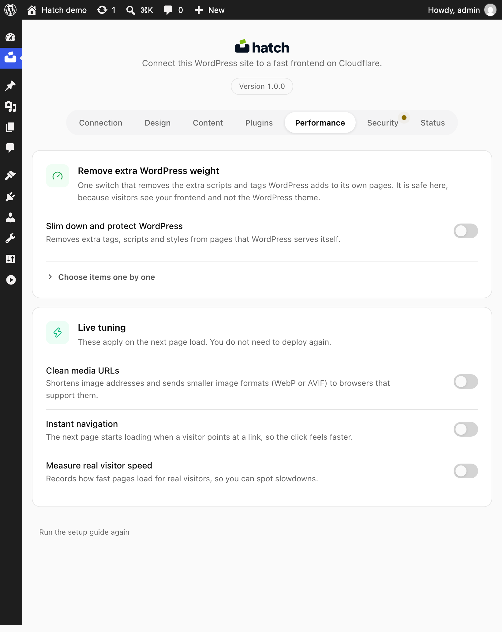
The Performance settings also include the image service (Sharp by default) and the image layout (constrained by default).
Image display options
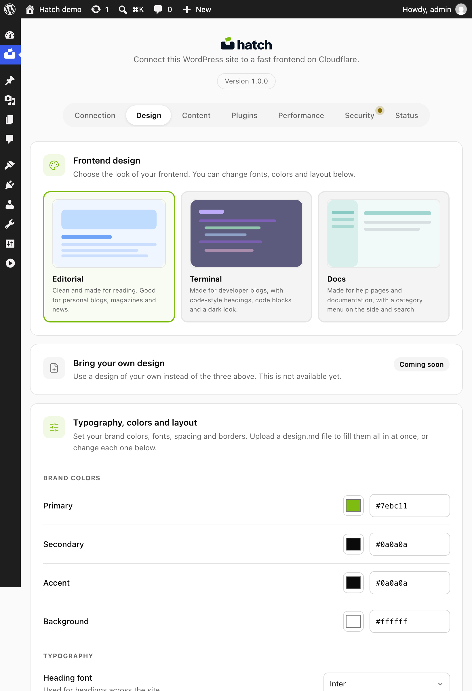
On the Design tab you can set how images behave. All of these are on by default:
- Lightbox: clicking an image opens it larger.
- Lazy load: images load as the reader scrolls to them.
- Hover zoom: a slight zoom on hover.
- Fallback gradient: a gradient shows when a post has no image.
- Retina 2x: sharper images on high-density screens.
You can also pick the aspect ratio for card images; the default is 2:1.
Local and temporary WordPress addresses
If WordPress runs on localhost, a Docker host or a trycloudflare.com address and a frontend is connected, Hatch copies one small file, hatch-url-rewrite.php, into wp-content/mu-plugins/ so images and links use your frontend address. It is never installed on a normal public domain, does nothing while Hatch is off, and is removed when Hatch is deactivated or deleted. If the folder cannot be written, Hatch shows a notice with the manual step.
Check your images
- Open a post with several images on the frontend.
- Click an image to check the lightbox.
- In developer tools, confirm images below the fold load as you scroll.