
Customise Hatch colours, fonts and layout
Set brand colours, heading, body and code fonts, density, corner rounding, page width and header for your Hatch Connect Astro frontend from wp-admin.
Last updated October 30, 2026
By the end of this guide you will have set your brand colours, fonts, spacing, corner rounding, page width and header for your Hatch frontend from the Design tab in wp-admin, without touching code.
Where the settings live
Everything in this guide is on the Design tab of the Hatch screen. The frontend reads your choices and writes them as CSS variables on the page, so they override the defaults of whichever design (Editorial, Terminal or Docs) you picked.
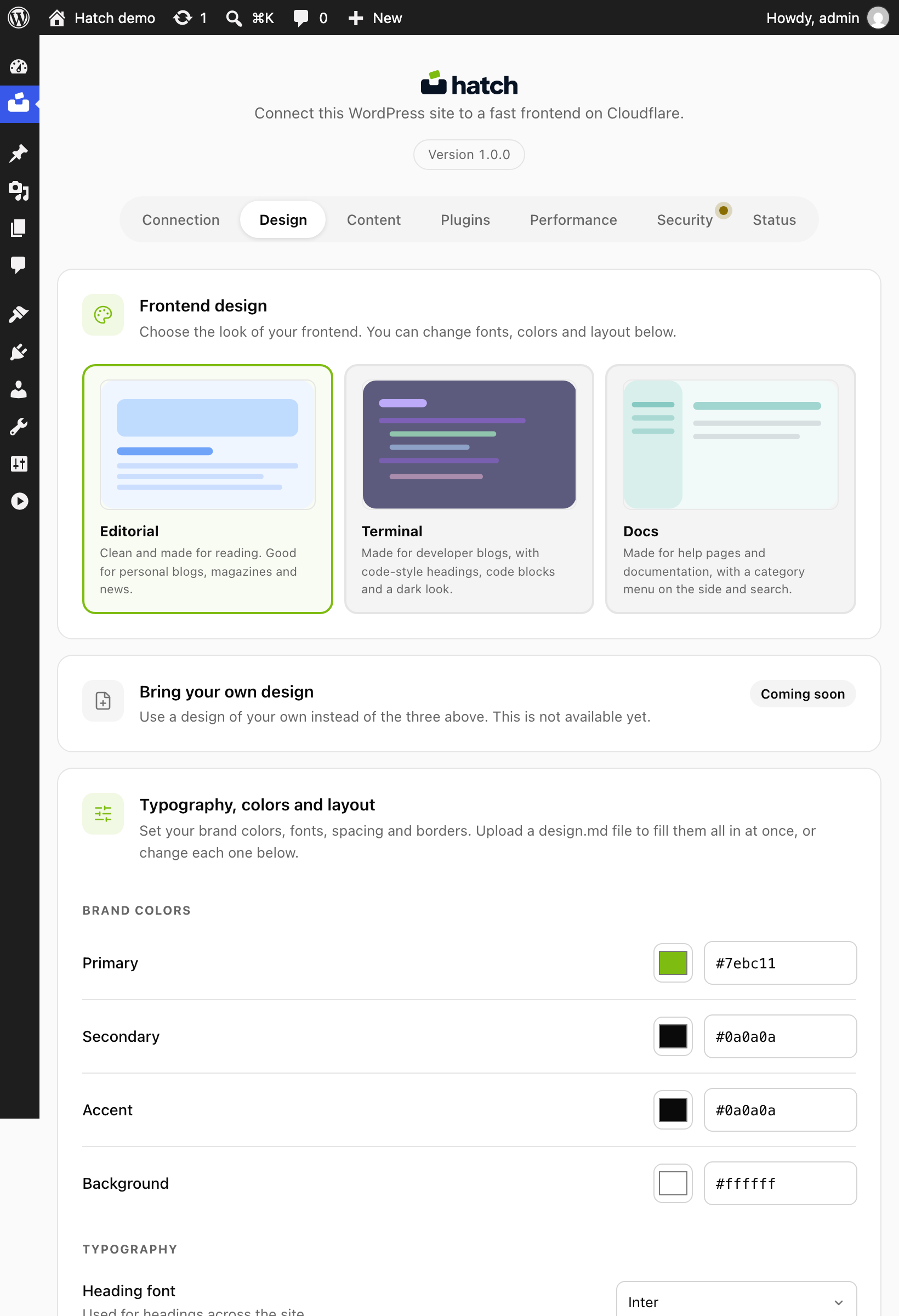
Set your brand colours
- Open Hatch, then the Design tab.
- Set the primary colour. It is used for links, buttons, category labels and focus rings. The default is
#ff6b35. - Set the accent colour for small chips and secondary lines.
- Set the text (foreground) and background colours.
- Choose a colour mode: light, dark or auto. Auto follows the visitor’s system setting.
- Save.
In dark mode the designs derive the dark palette from your background colour, so a warm cream background gives a warm dark and a cool white gives a neutral black.
Choose fonts
You pick three fonts: one for headings, one for body text and a monospace font for code. The defaults are Inter for headings and body and JetBrains Mono for code. The frontend loads your picks from Google Fonts, so the visitor’s browser contacts fonts.googleapis.com and fonts.gstatic.com.
Density, rounding and width
- Density: compact, comfortable (default) or spacious. Every spacing value in the shared stylesheet is multiplied by it (0.75, 1 or 1.25).
- Rounding: sharp, smooth (default) or extra. This sets the corner radius of cards, images and panels.
- Max width: 720, 1080 (default) or 1280 pixels for the content column.
- Borders: a border colour and a card shadow.
Post and archive layout
The same tab controls page templates:
- Single post sidebar: right, left or none.
- Single post hero: featured image, compact or none.
- Single post width: narrow, medium or wide.
- Archive grid: 1, 2 or 3 columns, with a card style of default, minimal or text, and excerpts on or off.
- Blog index: grid columns, pagination style (for example load more), and whether to show the hero and topics.
Header
- Make the header sticky, with an optional blur behind it.
- Show or hide the light/dark colour mode button.
- Choose how the brand shows, for example icon and text.
Check your changes
- Save the Design tab.
- Open your frontend and reload a post, the blog index and an archive page.
- Switch your system to dark mode to check the dark palette if you chose auto.
You can read the saved values at /wp-json/hatch/v1/features on your WordPress site, under design and aesthetic.
