
Choose a Hatch frontend design: Editorial, Terminal or Docs
Compare the three Hatch Connect frontend designs, Editorial, Terminal and Docs, pick the right one for your blog or help site and switch designs safely.
Last updated October 30, 2026
By the end of this guide you will know what each of the three Hatch frontend designs is made for, how to pick one in the Design tab, and what changes on your site when you switch.
What a design is
A Hatch design is the visual language of your Astro frontend: palette derivations, typography, section rhythm, header, footer, hero and card grid. Every design sits on the same shared stylesheet that already knows how to render WordPress core blocks, so your content looks finished whichever design you pick. Your colour, font and layout choices from the Design tab are applied on top of the design you choose.
Hatch ships three designs that have been finished and tested end to end.
Editorial
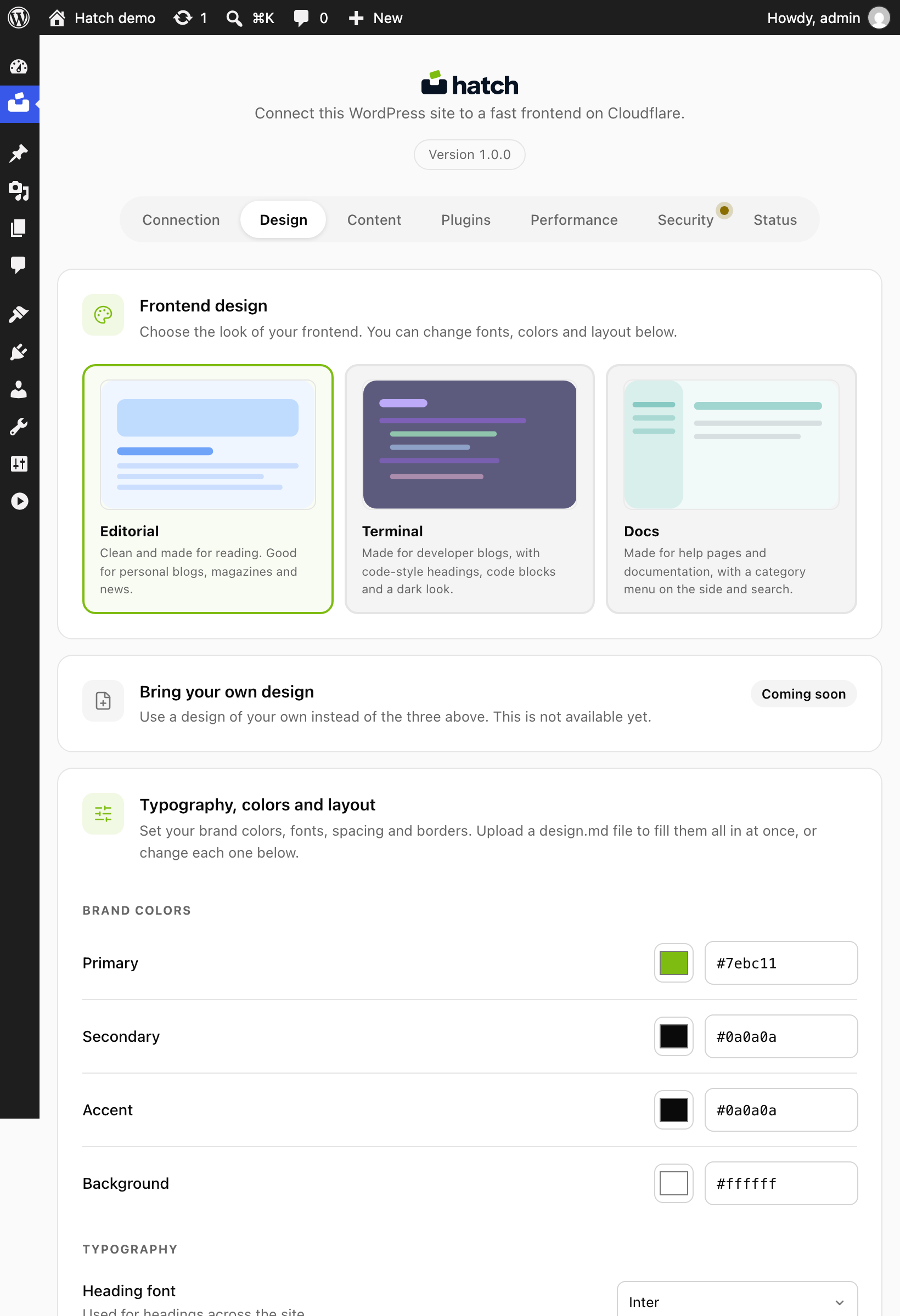
Clean and made for reading. Good for personal blogs, magazines and news. Its header is a wordmark with navigation and an optional actions row separated by a hairline rule, and its footer is a centred three-column layout. Internally its slug is blog.
Terminal
Made for developer blogs, with code-style headings, code blocks and a dark look. Its header is a monospace brand with inline navigation, and the footer is styled as a terminal prompt. Its slug is tech.
Docs
Made for help pages and documentation, with a category menu on the side and search. Its header is a centred wordmark with a version chip and a sidebar toggle, and the footer is a left-aligned brand. Its slug is docs. The Docs design wraps the article in a two-column grid with a table of contents.
Pick a design
- In wp-admin, open Hatch and go to the Design tab.
- Choose Editorial, Terminal or Docs.
- Save your changes.
- Open your frontend address and reload a post and the home page to see the new look.
How to choose
- Mostly long articles and news: Editorial.
- Tutorials with lots of code: Terminal.
- A knowledge base or product help centre: Docs.
Your content does not change when you switch. Posts, pages, categories and menus stay in WordPress, and the same core blocks are styled by every design. You can try each one and switch back.
What about other designs?
Earlier work on Newspaper, Marketing and Minimal designs is parked and not offered, because those never went through the button, block and form passes the three core designs got. The Design tab also shows a Bring your own design card marked Coming soon. It is not available yet and cannot be selected. Until it is, if you need your own look, a developer can build a theme in the frontend source; see the custom theme guide below.
What to do next
- Customise colours, fonts and layout
- Set up the reading experience
- Build a custom Hatch theme